The Three-Way Financial Model: Why Businesses Use It, and Why Your Household Should Too
Most companies of any size run on three linked financial statements, updated together as one model. Here's what 'three-way' actually means, and why a household forecast needs the same structure to be worth anything.
Most businesses of any real size run on three financial statements: a profit and loss account, a balance sheet, and a cashflow forecast. Finance teams call a model that keeps all three properly connected a "three-way model" or "three-statement model." It's a standard technique for any organisation planning its finances properly, and the idea behind it applies just as well to a household.
The three statements, and the question each one answers
Each statement exists because it answers a question the other two can't. The P&L asks: are we making money, over a given period? The balance sheet asks: what are we worth, right now, once everything we own and owe is netted off? The cashflow statement asks: do we actually have the cash, on the day, to pay what's due? A business, or a household, can be profitable and still run out of cash, or hold a strong net worth and still struggle to cover a given month. You need all three to see the full picture.
Why 'three-way' means linked, not just three
The important word is "way," not "statement." Having three separate spreadsheets that each show a different number isn't a three-way model. It's three unrelated guesses that happen to sit next to each other. A real three-way model wires the statements together mechanically, so a single change flows through all three automatically and they always agree.
Overpay your mortgage by £300 this month, for example, and that one decision has to move three ways: it reduces the cash sitting in your account (cashflow), it turns £300 of cash into £300 of equity, so the balance sheet changes shape without changing total (net worth), and it reduces the interest you'll pay going forward, which is what does lift your net worth from then on (P&L). If those three views aren't actually connected, updating one and not the others leaves you with a picture that quietly stops being true.
What this looks like translated to a household
- P&L → what comes in vs what goes out: salary and other income in, bills and spending out, over a month or a year
- Balance sheet → your net worth: everything you own (house, savings, pension) minus everything you owe (mortgage, loans, credit cards)
- Cashflow → the actual day-by-day movement of money in your account: can you cover this month's direct debits, not just on average, but on the day they leave
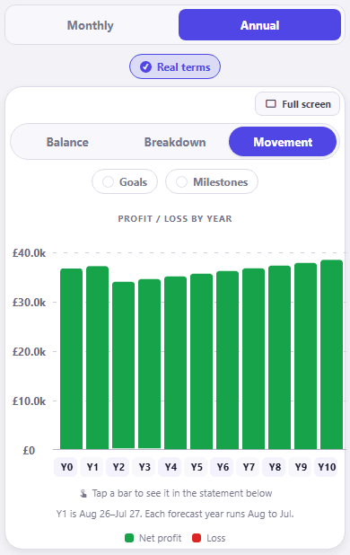
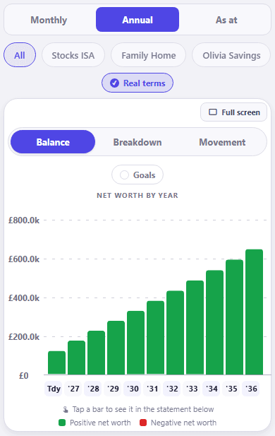
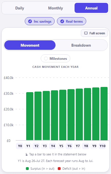
We've explained before why profit and cash are not the same thing, and mixing them up is one of the most common ways a household misjudges its own position. The three-way model is the fix: it doesn't let you look at one in isolation.
Why most household finance tools only give you one
This is also why most personal finance tools feel incomplete even when they're well built. A spending tracker gives you a cashflow-ish, backwards-looking view of spending. A net worth tracker gives you a balance sheet snapshot. Almost nothing gives a household the equivalent of what a finance team builds for a business: one model, all three statements, mechanically consistent, and forward-looking rather than a record of what already happened.
How CrestCast builds this for your household
This is the concept CrestCast is built around. Change one input and it ripples through all three views automatically, the same way it would in a business model, which is the difference between three numbers that happen to sit on the same screen and a single model you can actually plan a household's financial future around.
›How to check this
These are CrestCast's own Profit & Loss, Net Worth and Cashflow screens for the same demo household, in the app's Combined (household) view, so all three read off one set of figures rather than three.
No scenario was modelled or changed for this post; the demo household's default forecast is shown as-is across all three views, on the annual setting. Real terms is on for every chart, which is the app's default, so each bar is stated in today's money rather than in the nominal figure a statement would show in that year. The Net Worth chart is on Balance, and both the P&L and the Cashflow chart are on Movement, which plots what moves through the period rather than what is left sitting at the end of it. The Cashflow chart also has Inc liquid savings on, again the default, which folds the liquid savings pots into the position rather than treating a transfer into one as money gone.
The Milestones toggle is off on all three charts, so no dated events are flagged on any of them.
Every figure in a CrestCast forecast runs for ten years and then stops. The reason is set out in Why We Forecast Ten Years, Not Thirty, along with when a longer view is the right tool.
Which parts of a model are arithmetic and which are assumptions decides how far to trust it. How Accurate Is a Financial Forecast, Really? puts figures on that split: what a four point gap in assumed return is worth over ten years, and what one missing bill costs.
Run the three-way model on your own household
Enter your income, bills, debts and assets once, and CrestCast keeps your cashflow, profit and loss and net worth linked and updated together, ten years ahead.
30 days free, no card. Then £7.99 a month or £79.99 a year for the whole household.
Put your own numbers in and see the next ten years.
30 days free, no card. Then £7.99 a month or £79.99 a year for the whole household.